Monitoring the Greenland Ice Sheet ”as close to real-time as possible”
Now anyone can see how quickly the ice that forms the Greenland Ice Sheet is moving, as new data roll in approximately every other week. This provides researchers all over the world with the best opportunities to discover and predict changes in the enormous, northernly mass of ice.
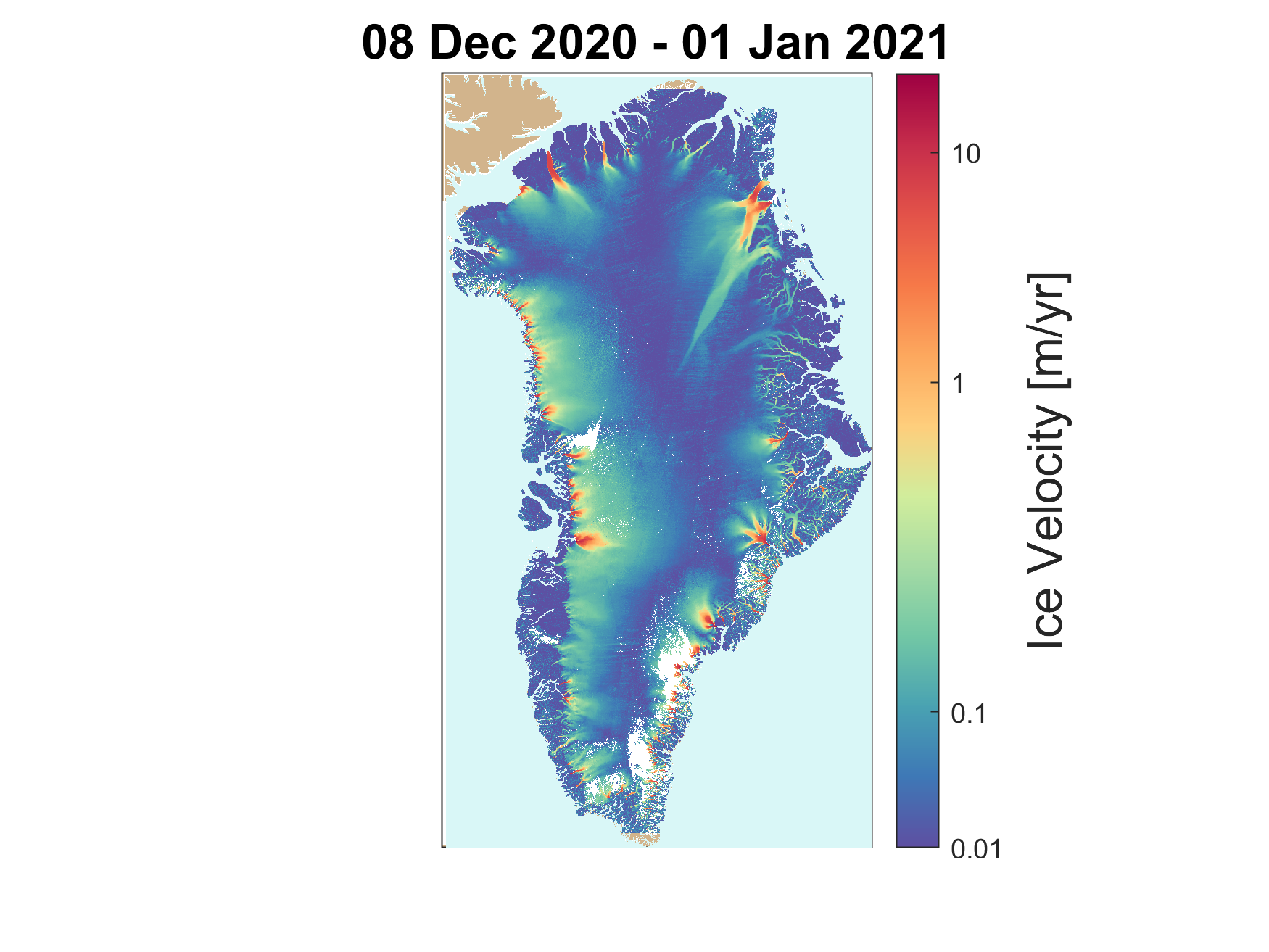
The Greenland Ice Sheet is not still – it moves from the middle and out towards the edges. It is faster in the summer when there is a lot of melting, but the velocity can be affected by many different factors all year round. Changes in this velocity is valuable knowledge if you want to predict the effect of climate change on the enormous mass of ice.
Recently, PROMICE published a ‘free for all’ ice velocity map of the entire Greenland Ice Sheet with data that are updated every 12 days and have a spatial resolution of 500 x 500 metres. This may make glaciological studies much easier.
”The maps are free and can be downloaded by everyone with set time intervals. This provides researchers worldwide with a much better opportunity to follow what happens to the Greenland Ice Sheet while it happens, which is a huge advantage when you work with something that is so dynamic,” says Anne Munck Solgaard, Project Manager on the velocity map project and researcher at GEUS’ Department of Glaciology and Climate. She was one of the researchers who started the project back in 2016, and together with colleagues at DTU Space she has worked on optimising and collecting the correct data necessary to make the map ever since.
”It has taken time to set up a system that can collect and process the terabytes of data we need to make the velocity maps. Now, we have a more or less operational set-up and the majority of the work runs automatically,” she says.
Discovering the behavioural pattern of the glaciers
The frequently updated maps in high resolution makes it possible to study the individual parts of the ice as well as the whole in much greater detail than before.
”Now we can get a much better idea of what happens both to the individual glaciers and the whole Greenland Ice Sheet, not just during a season but over several years,” says Anne Munck Solgaard.
”I think it’s pretty amazing that I can sit here in my office and see it all in such great detail – almost watching it happen.”
Amongst other things, the maps make it possible to discover the ’secret life’ of the glaciers, as the researcher says. Using the very frequent data sets dating all the way back to the project launch in 2016, the researchers can analyse the ‘behaviour’ of all the glaciers during the year and under different weather conditions etc. We can learn much more about how glaciers work and interact with the climate when we are able to observe them in detail over time. And the same goes for the Greenland Ice Sheet.
”We can make much more detailed analyses and projections of the mass loss of the Greenland Ice Sheet over time, and this in turns gives us a much better picture of how much the ice contributes to sea level rise for instance.”
And the map has already been used in several studies, says Anne Munck Solgaard, both in GEUS’ own glaciological department and by other researchers. As she says, different groups of researchers have made maps before, but until now, none have been updated as frequently and as regularly.
As fast as it gets
Although 12 days sounds like a lot and not particularly like ’real-time’, it is as fast as it gets right now according to Anne Munck Solgaard. The two satellites, from which the researchers collect the data, fly over the same place on the Greenland Ice Sheet and record data every 12 days – 6 days staggered. In order to get the best map, data from the two satellites are combined and then the two sets of data are processed by a powerful computer and quality checked before a new map is produced.
This is incredibly good compared to just a few years ago, says the researcher.
”Even in 2014, a velocity map of the Greenland Ice Sheet was not something you had access to the way we have today. Previously, no-one acquired these amounts of data above the Greenland Ice Sheet, and the data were not easily accessible by all. It was a breakthrough when data from the newly launched ESA Sentinel satellites as well as from the American Landsat satellite were made free for all.”
Therefore, researchers only got an indication of how the ice was moving, since the velocity very much depends on the season and can change a lot from one year to the next.
”The PROMICE velocity map makes it possible to follow the ice dynamic as close to real-time as it is possible right now, and this gives us a much better opportunity to discover and examine changes and differences from one year to the next or from one month to the next,” she says.
Always room for improvement
Of course, there is still room for improvement. Amongst other things the research team would like to add one more measurement so that the velocity can be measured even more precisely:
”We would like to include a method called InSAR in our setup. Right now, the maps are made using a method called offset tracking, which works really well in the areas where the ice moves quickly. The other method exploits another part of the data and works well in the inner parts of the Greenland Ice Sheet where the ice moves slowly. By combining the two, we get the best picture of reality,” says Anne Munck Solgaard.
How the map is made
- Radar data of Greenland are acquired from The European Space Agency (ESA)’s two Sentinel 1 satellites.
- All data are processed, the many singular parts are gathered into one map and ‘noise’ is taken into consideration.
- Uncertainties are frequently checked by comparing data with measurements from PROMICE measuring stations in different places on the Greenland Ice Sheet.
- Data are quality checked manually and a new map is generated and put online: https://dataverse01.geus.dk/dataverse/Ice_velocity.

